Makers of Tomorrow 2019 - Signs of the Times Magazine

Comment

Makers of Tomorrow 2019 - Signs of the Times Magazine

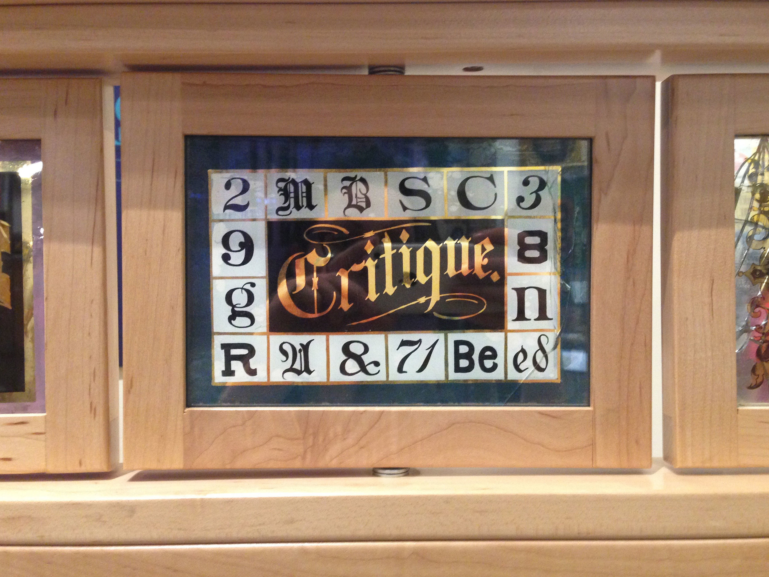
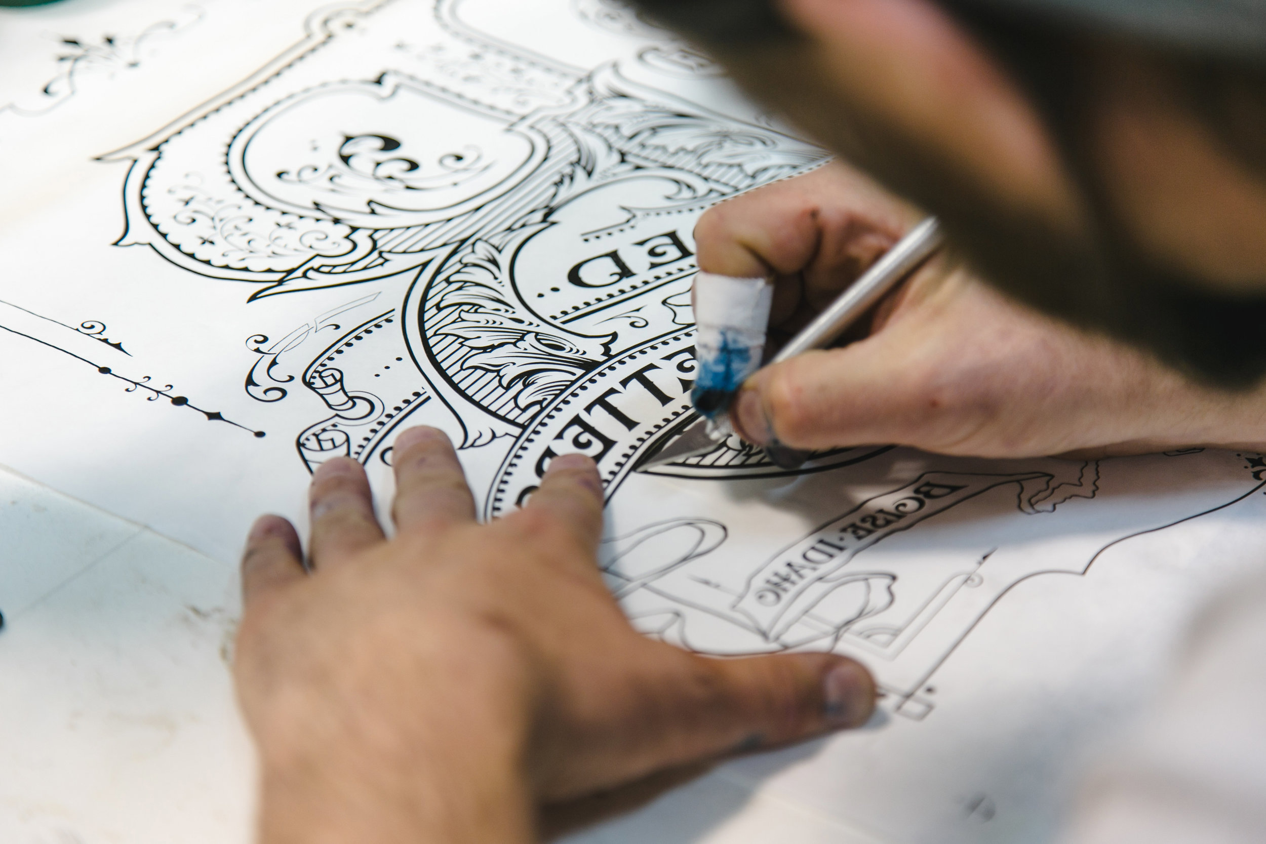
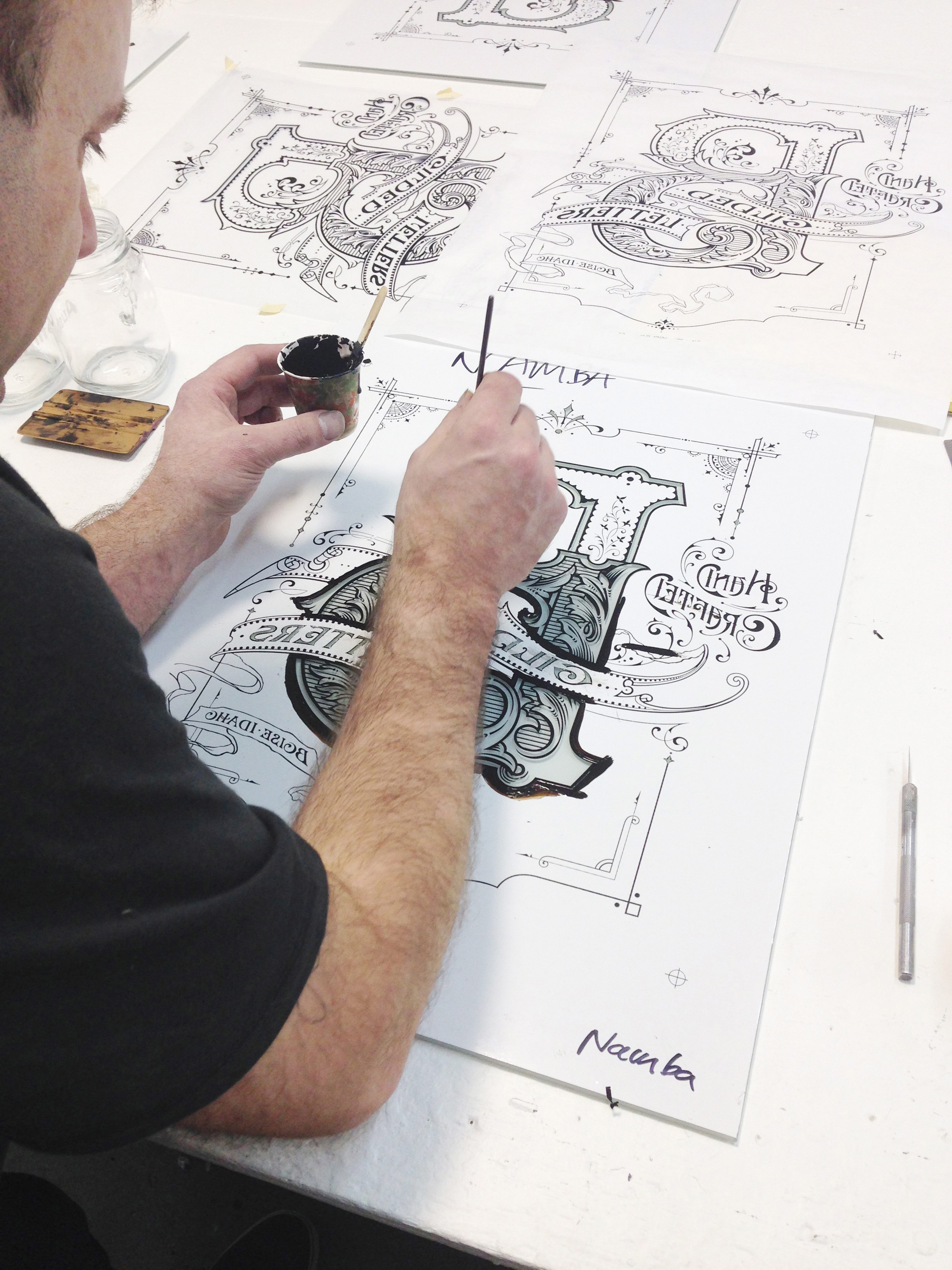
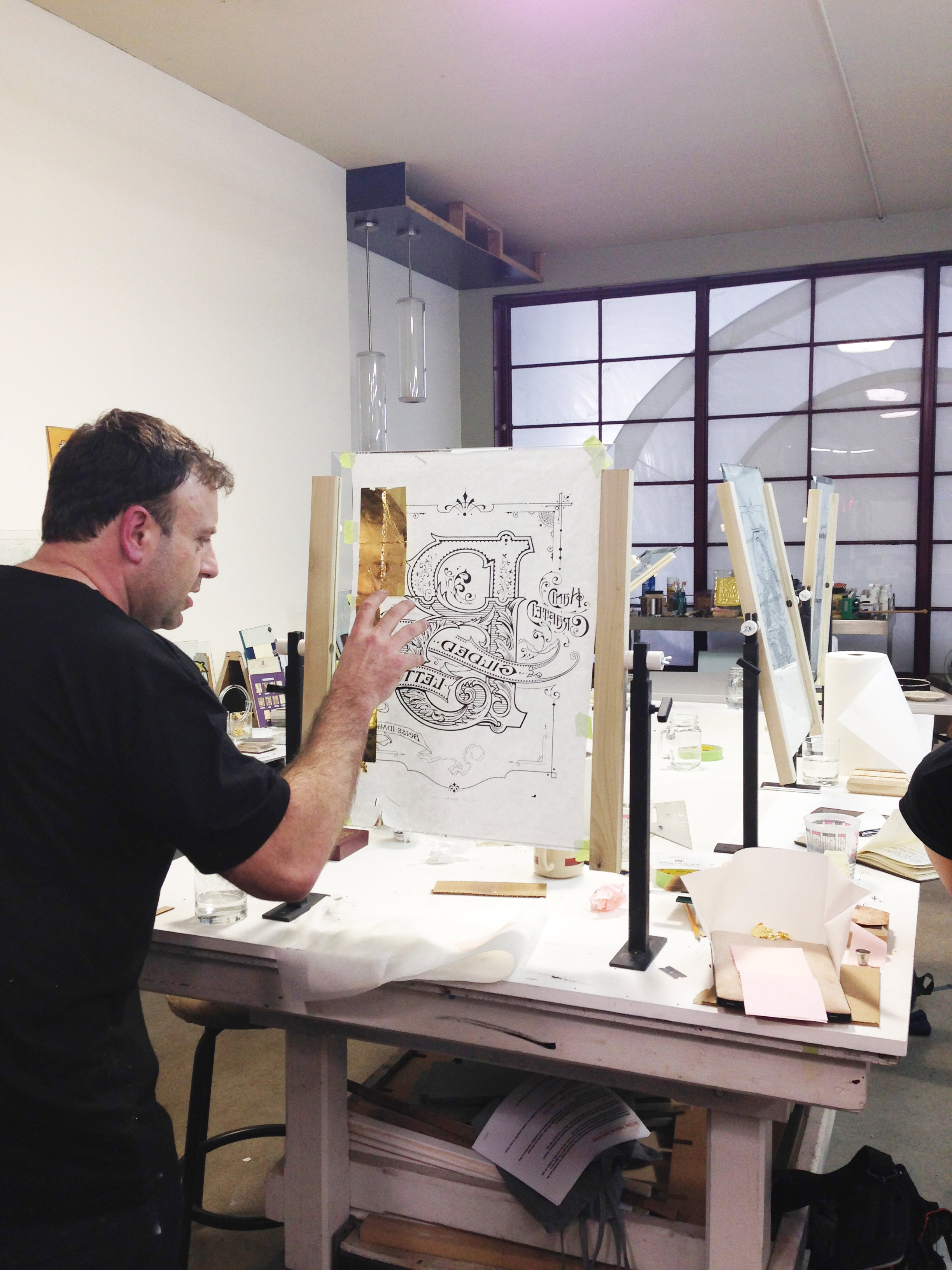
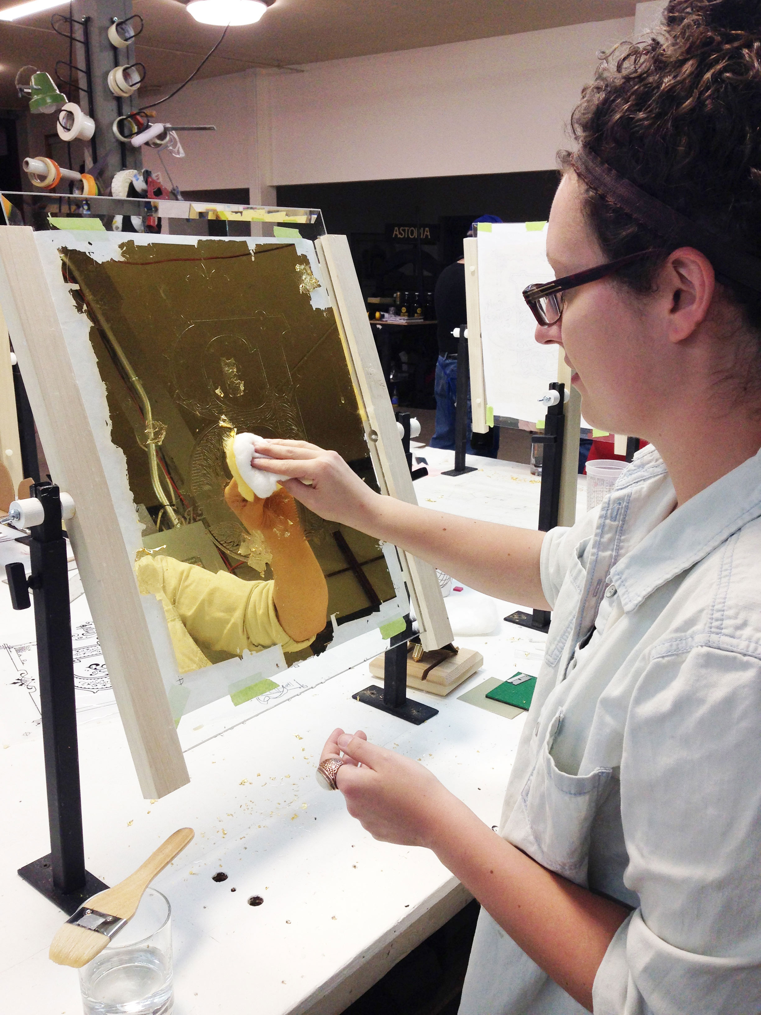
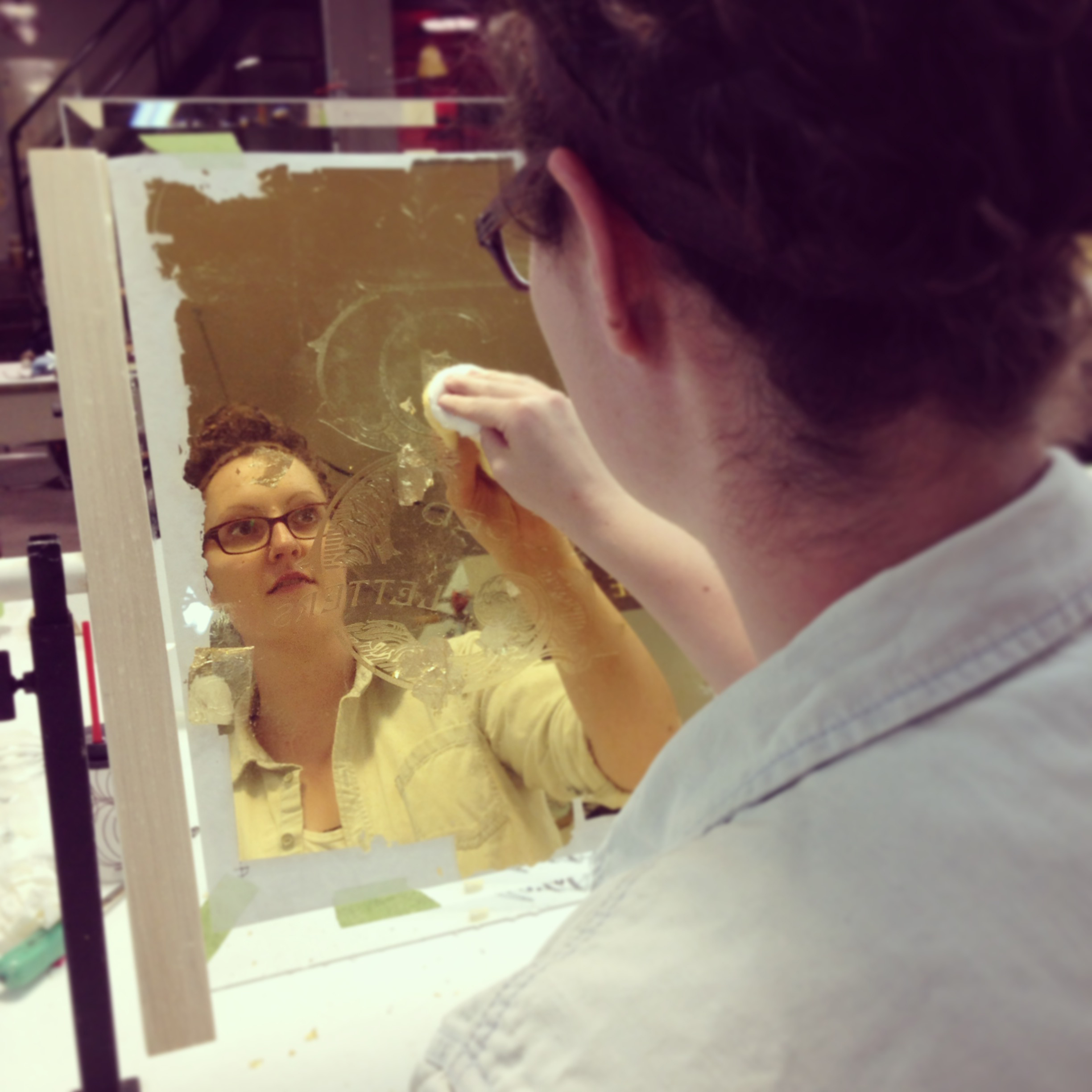
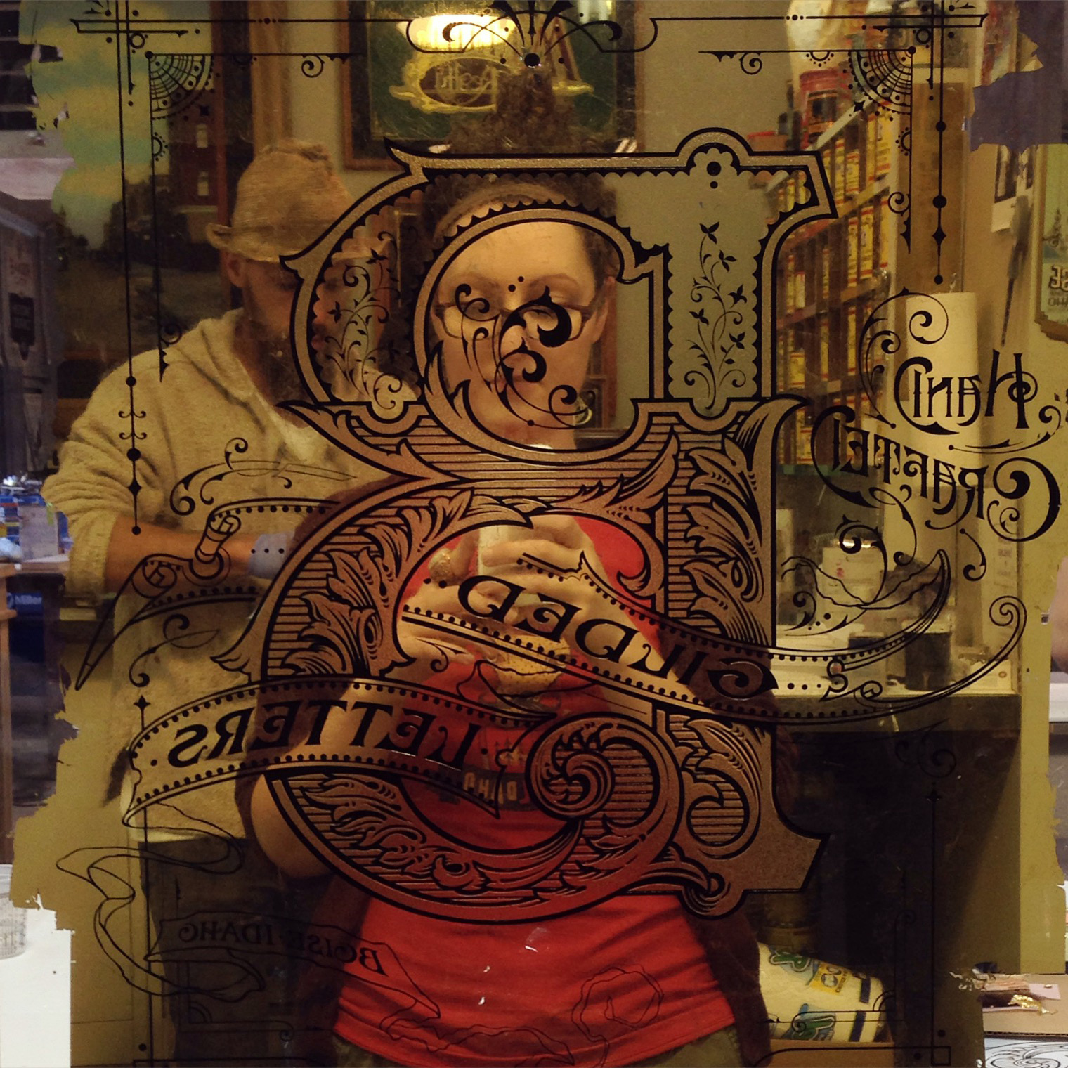
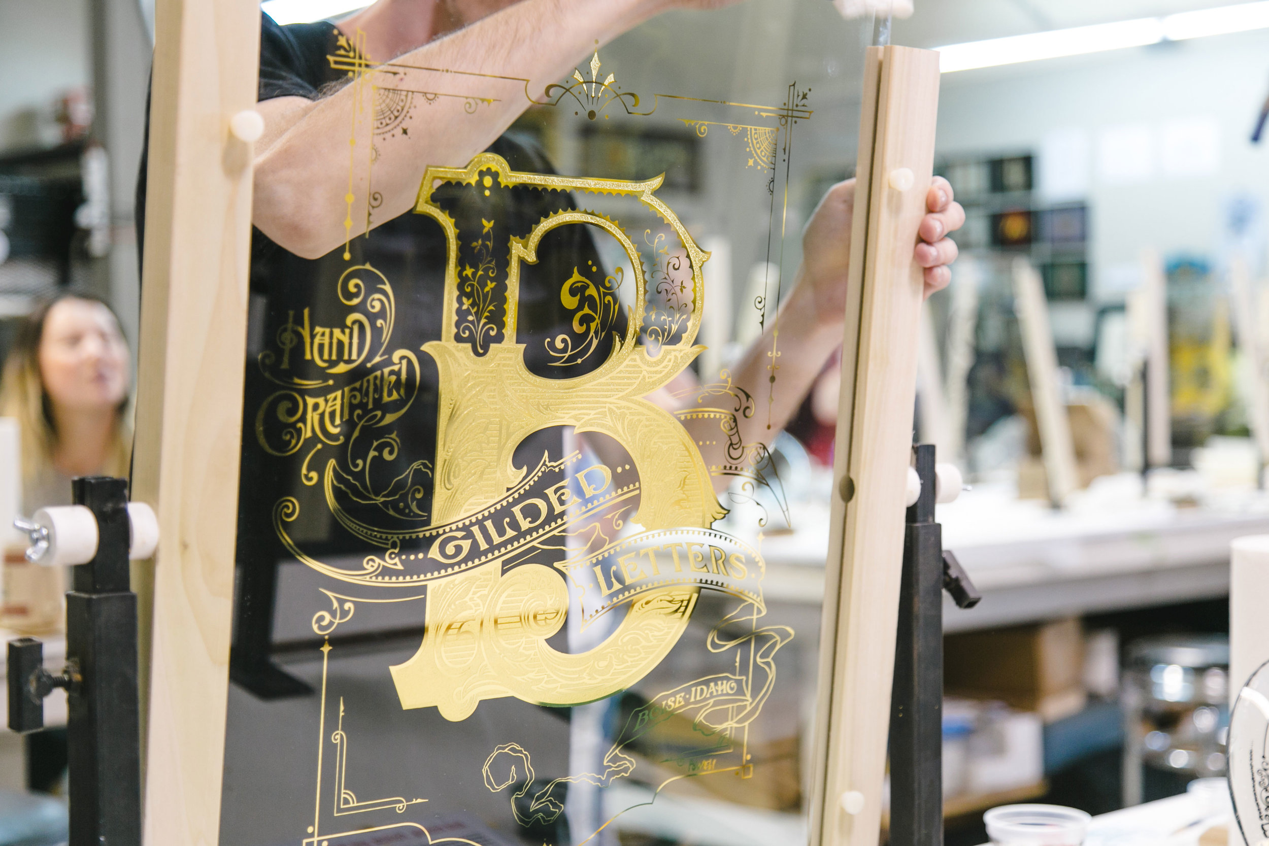
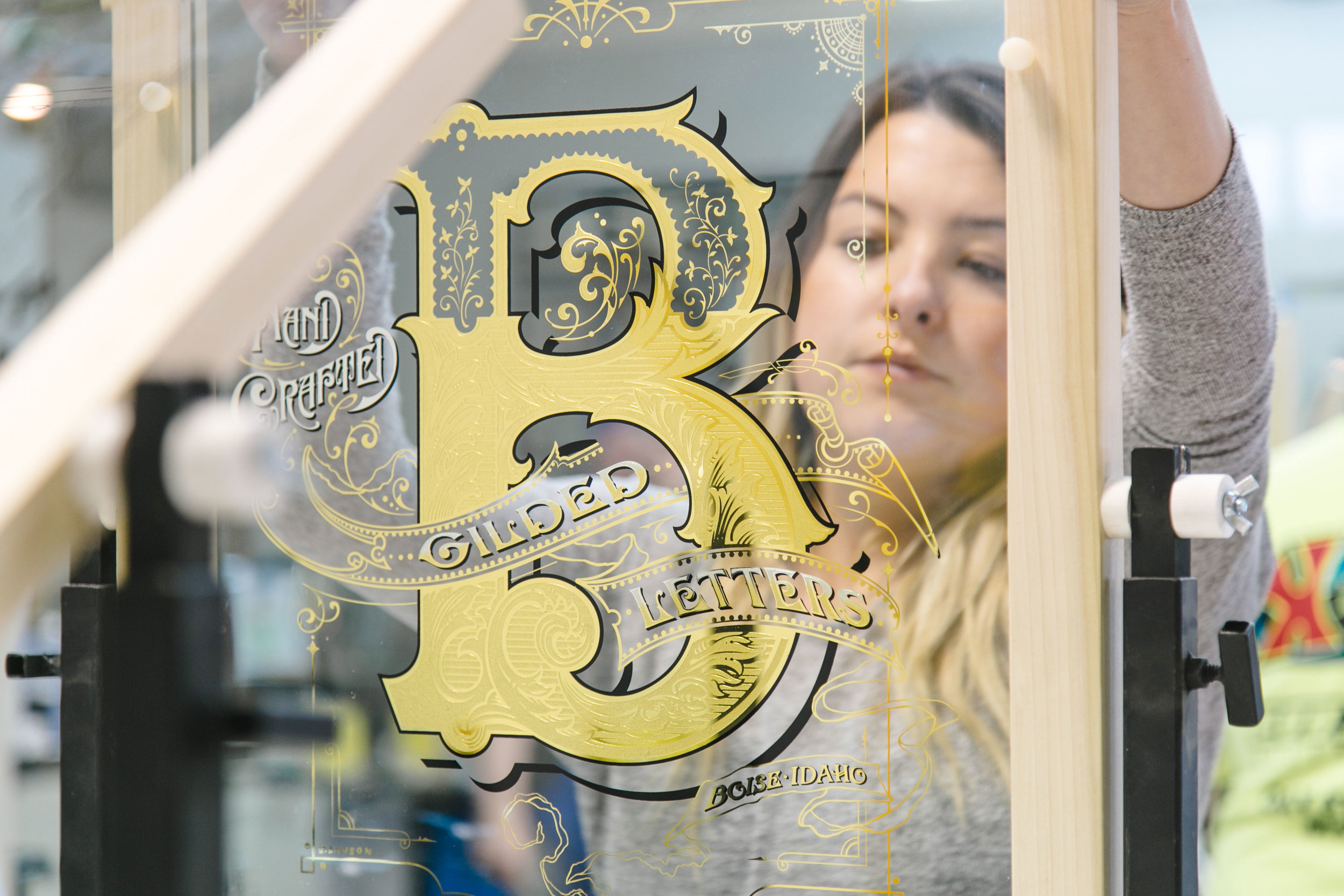
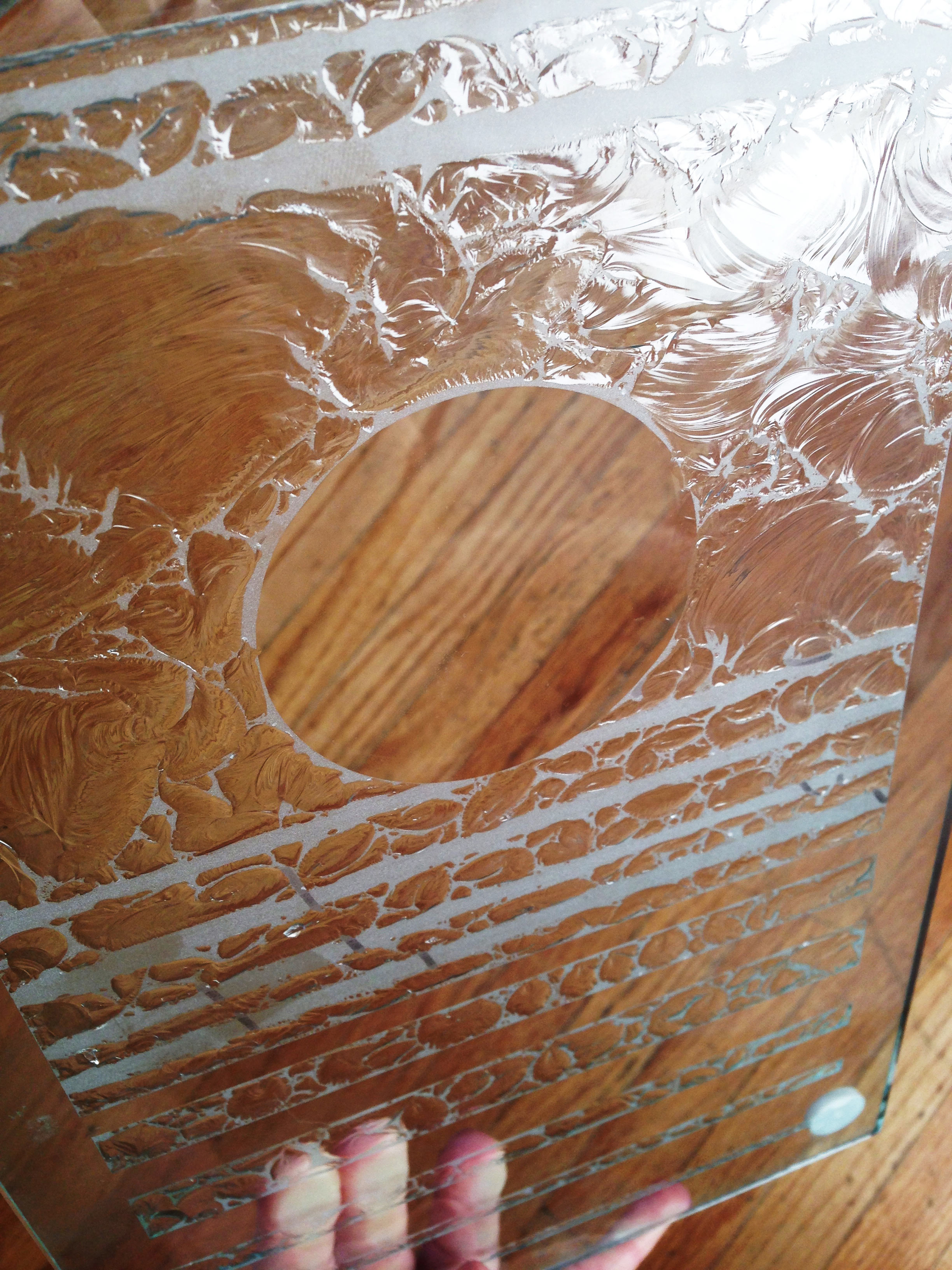
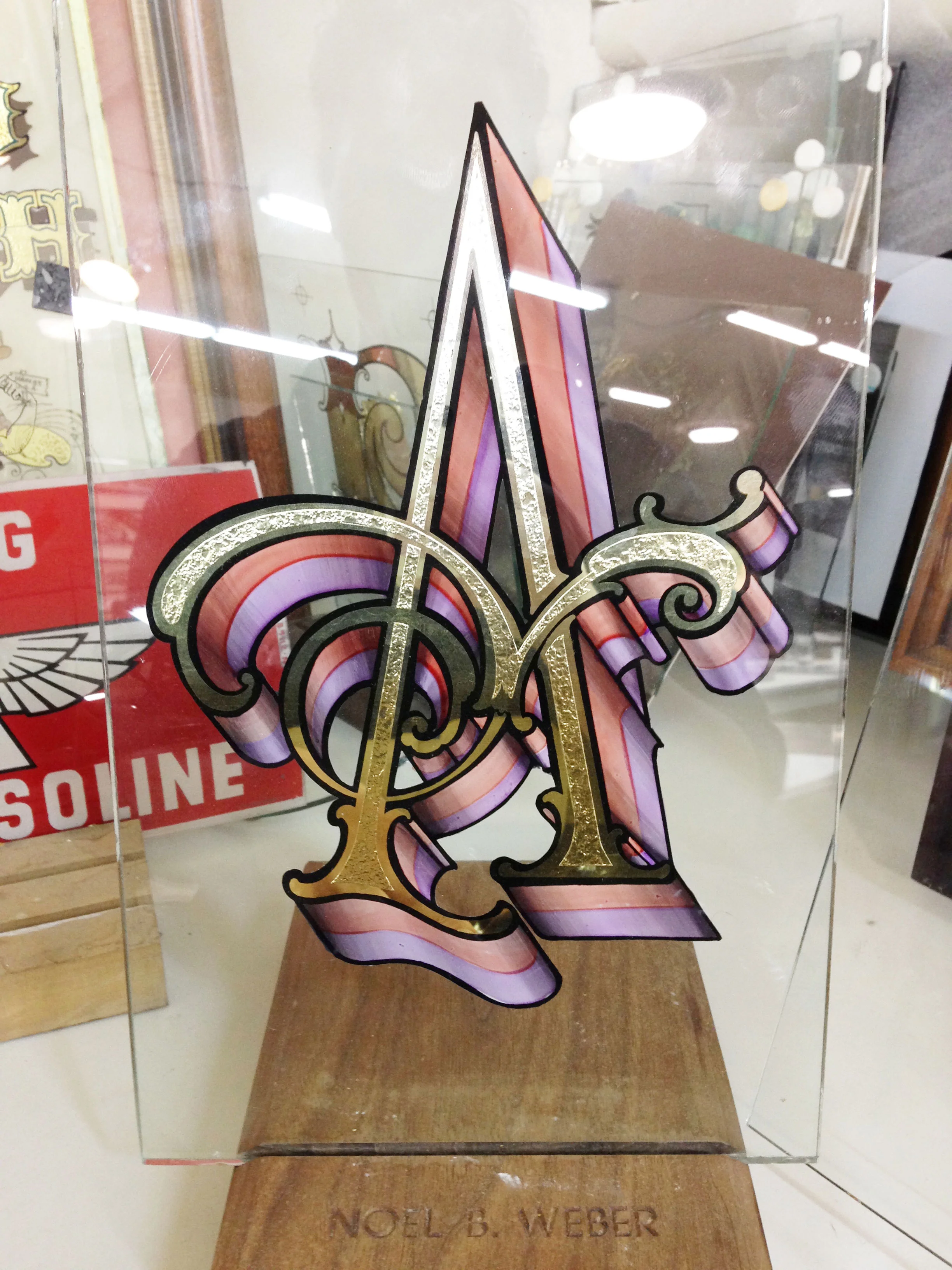
Close-up of gilded glass artwork I completed for The Gilded Sparrow Tattoo

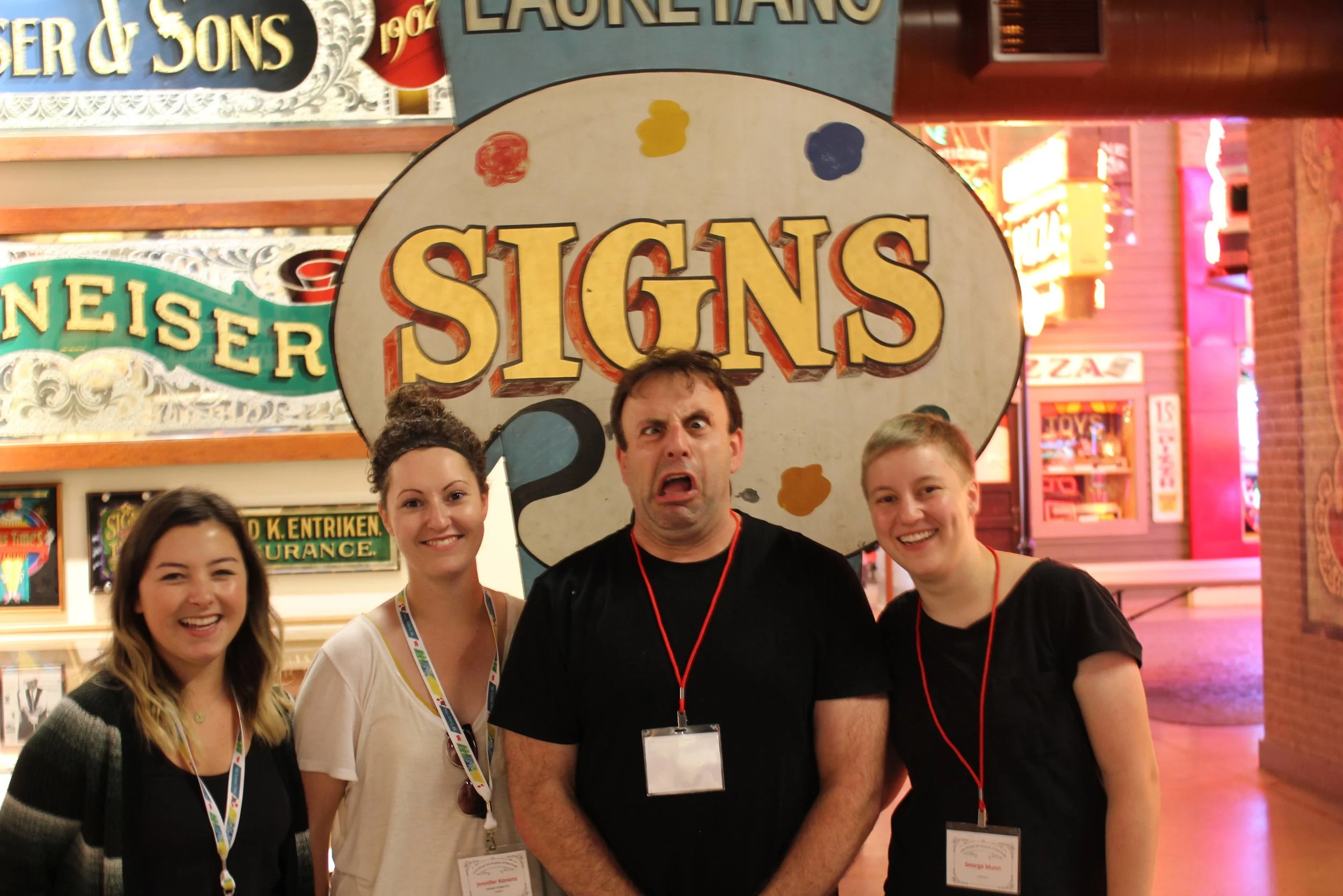
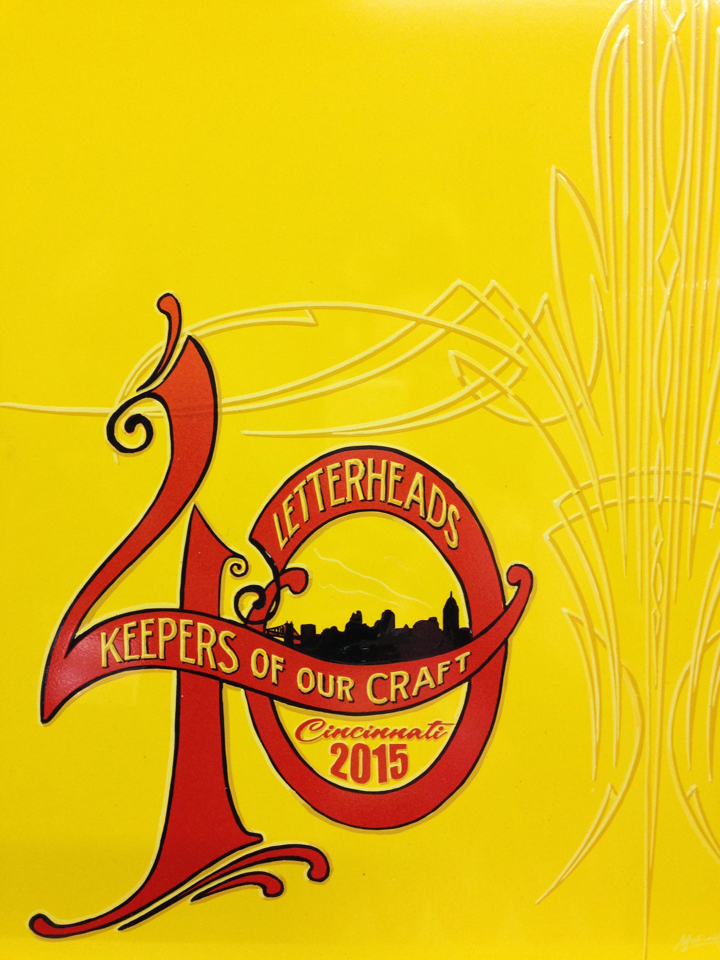
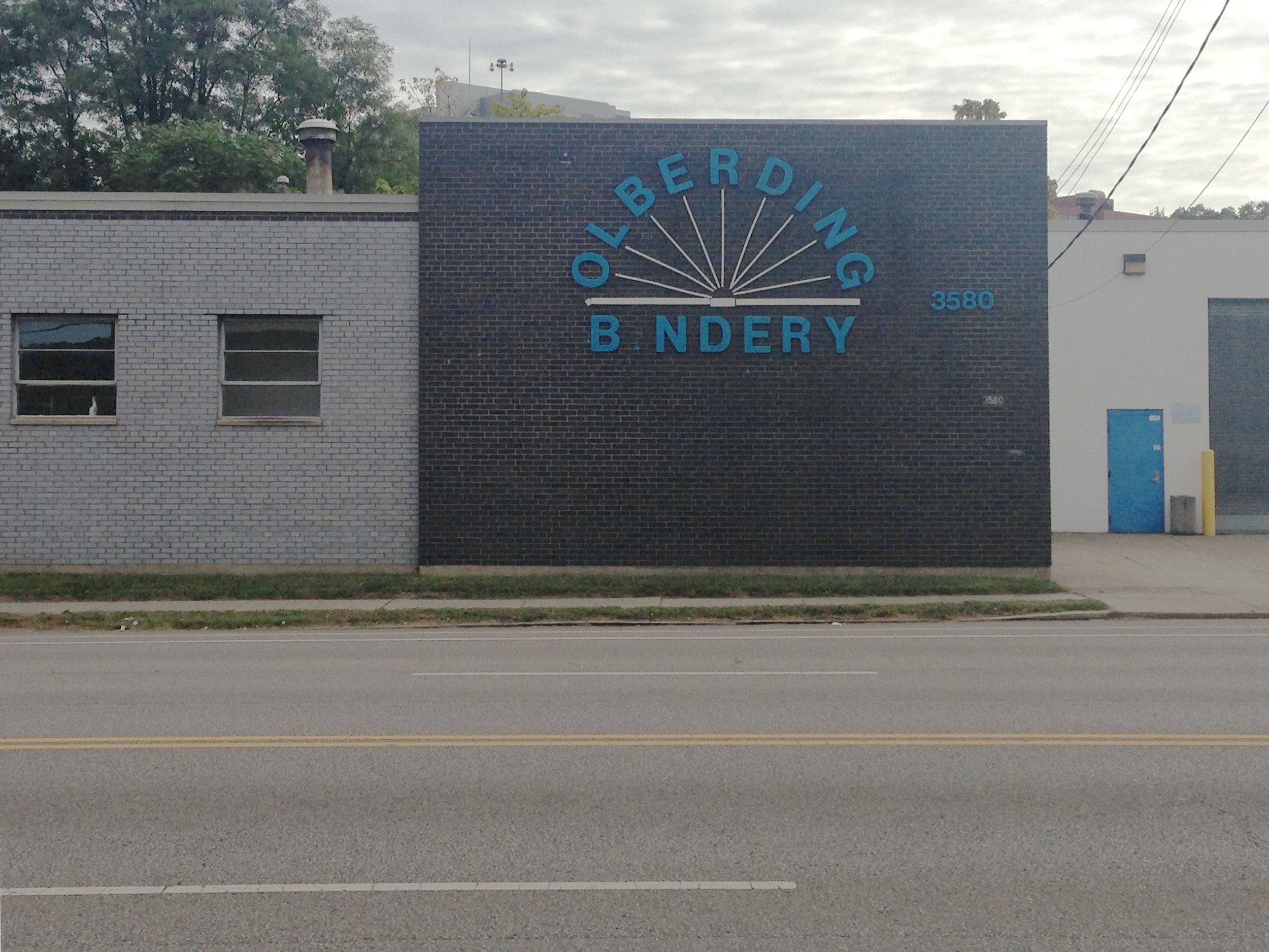
If you’re into sign painting, you’ve heard of the legendary “Signs of the Times” magazine. It’s an American sign trade periodical that goes back to 1906 when it regularly featured sign painters and technical sign crafting tips and tricks. These issues are now collectible and highly sought after by the up and coming generation of sign painters. While I haven’t been able to nab any of these issues, it was pretty cool to be honoured in one of their annual competitions called “Makers of Tomorrow”. I was recognized as one of this year’s 5 sign makers under 40 who represent the future of the sign trade. So now I officially have a copy of the magazine - with my work on the cover! Not a bad way to start the year. Here’s a link to my full maker feature.

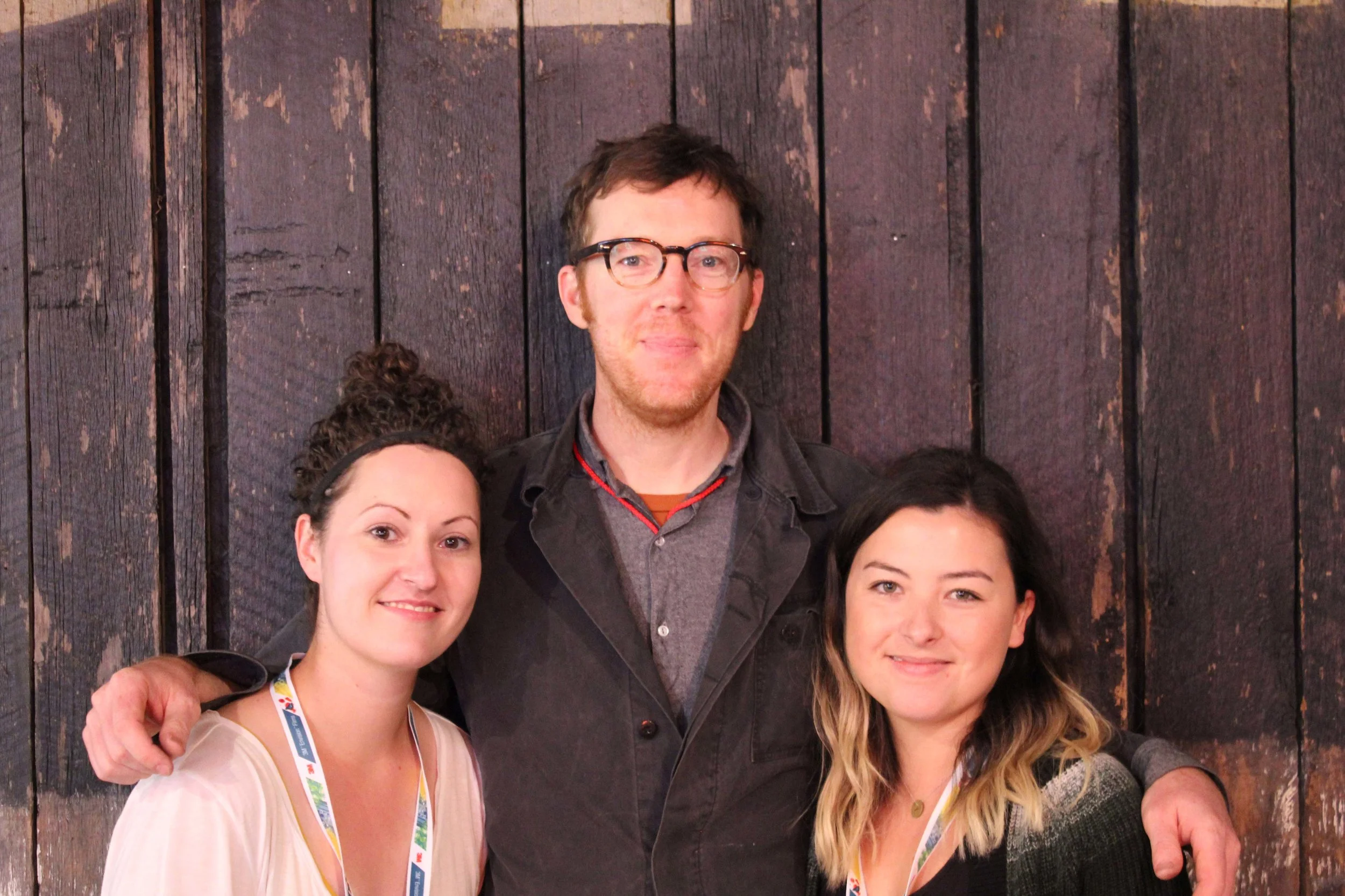
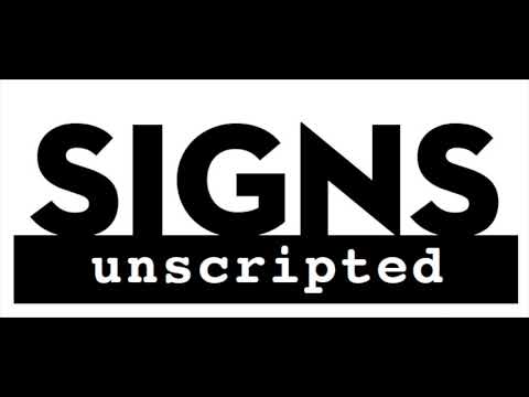
Robin Donovan, the editor in chief of the magazine contacted me a few days afterwards to do a short phone interview for their podcast. Of course I was delighted to answer some questions about how I got started, where I find my design inspirations, and what it’s like working as a sole proprietor. It was fun to think back to 2013 when I started out and how things have changed and evolved since then. The interview can be found here in Signs Unscripted - Ep. 5 - Jennifer Konanz.

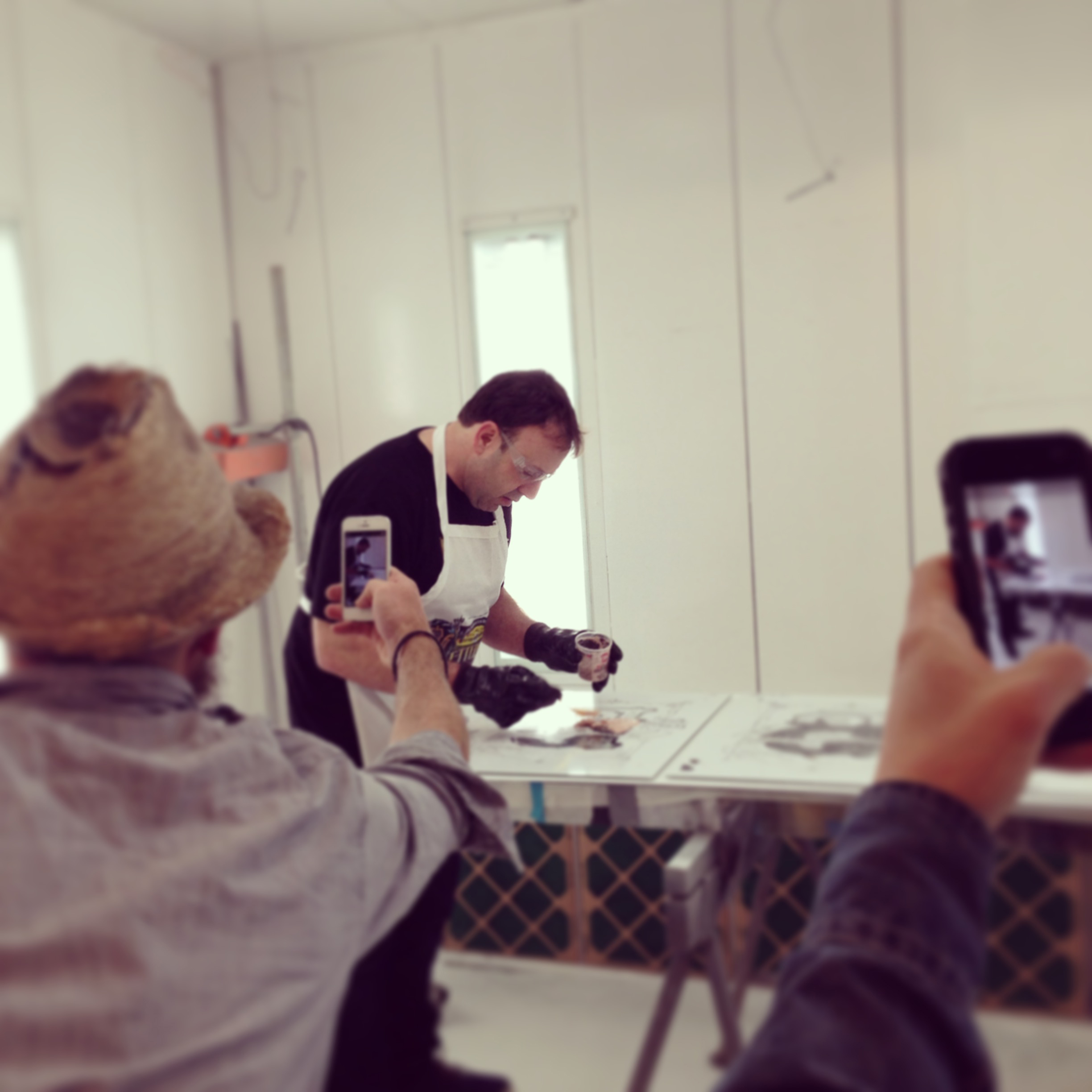
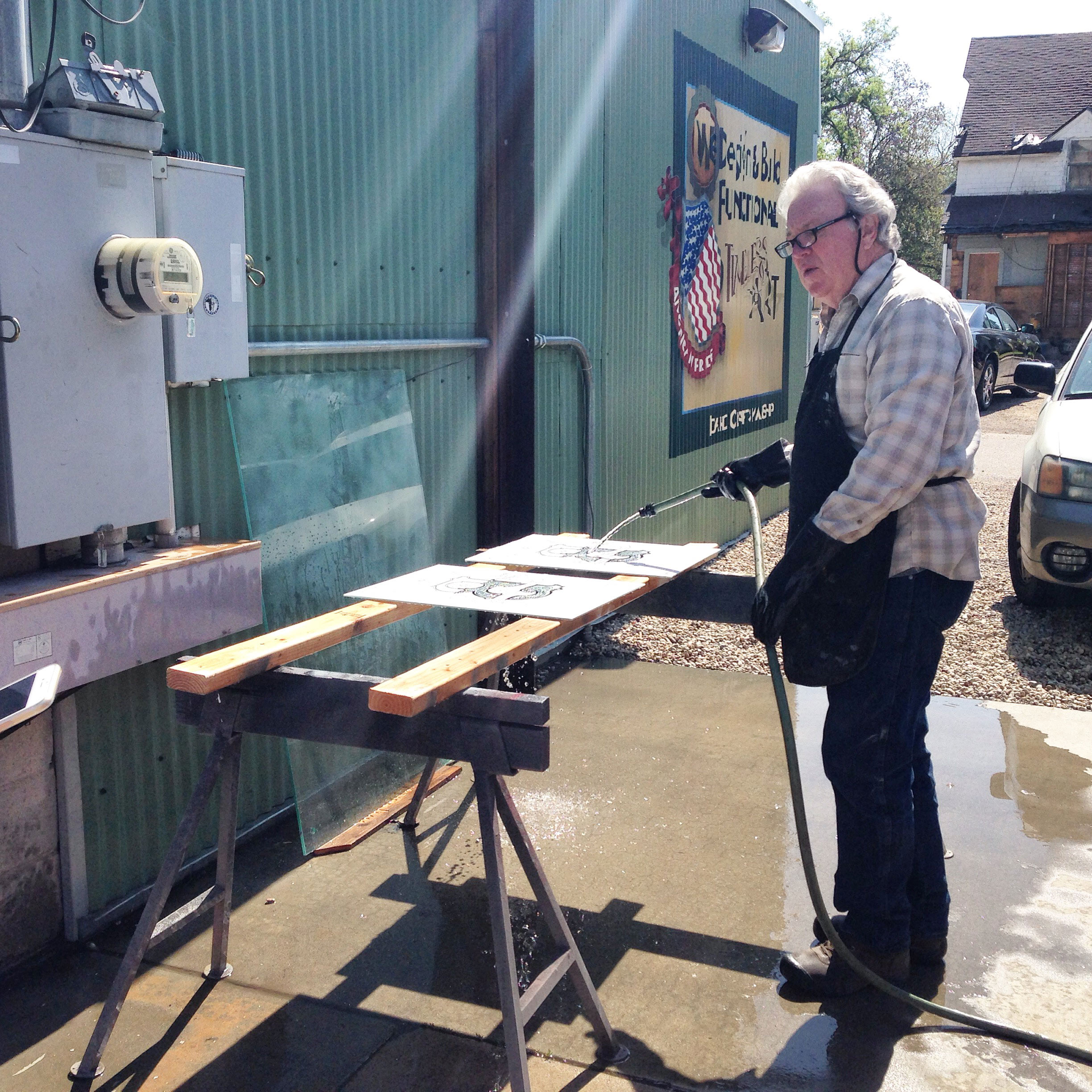
Of course I haven’t done this alone. I have my husband to thank for the nomination and for supporting the two of us while I transitioned to full-time sign painting. Not only has he helped out financially with the business, but he’s constantly talking through business strategies with me, giving me aesthetic feedback, and getting his hands dirty with everything from putting up scaffolding, helping me paint, weld, and build custom metal / woodwork for many of my sign projects through his own budding business House and Object. He is one of the indispensable “& Co.” members of my business without whom this endeavour wouldn’t be possible.

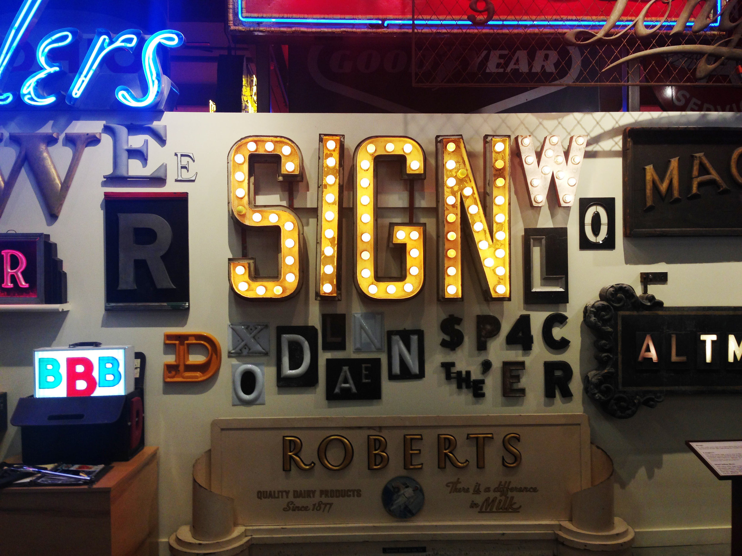
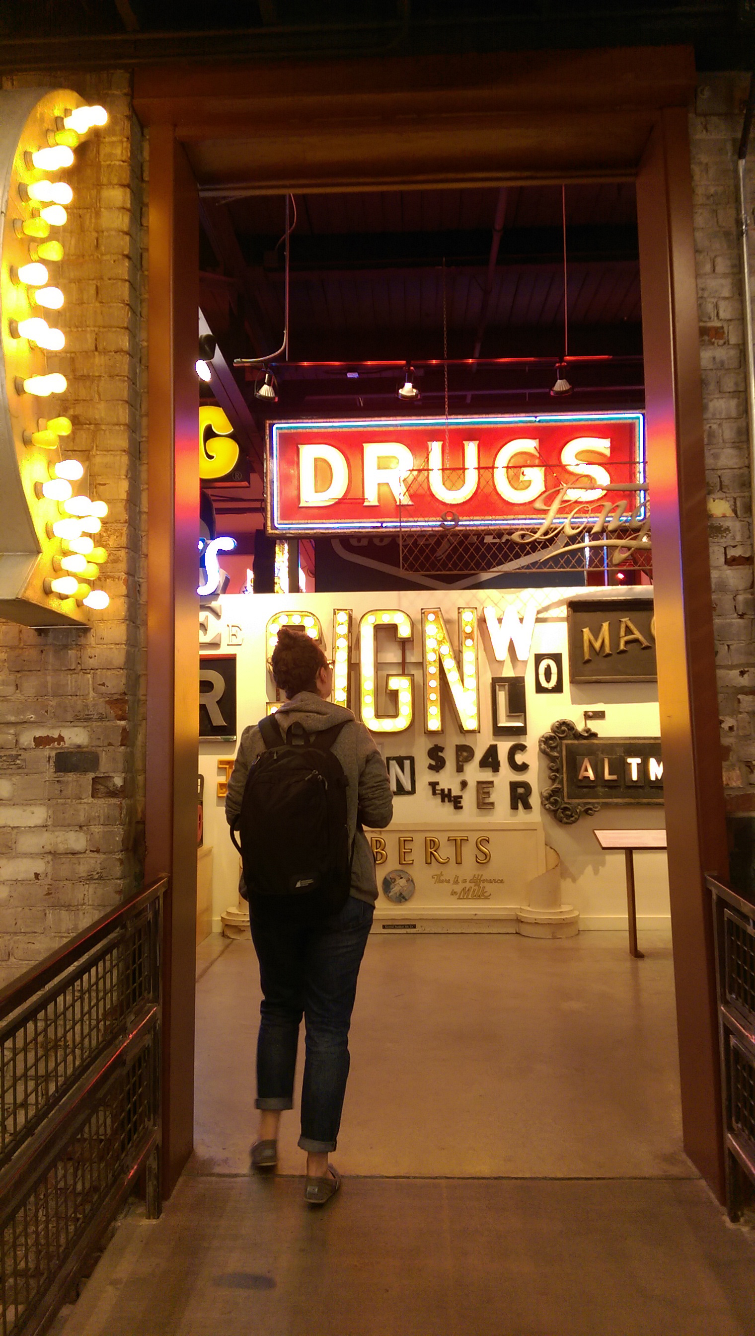
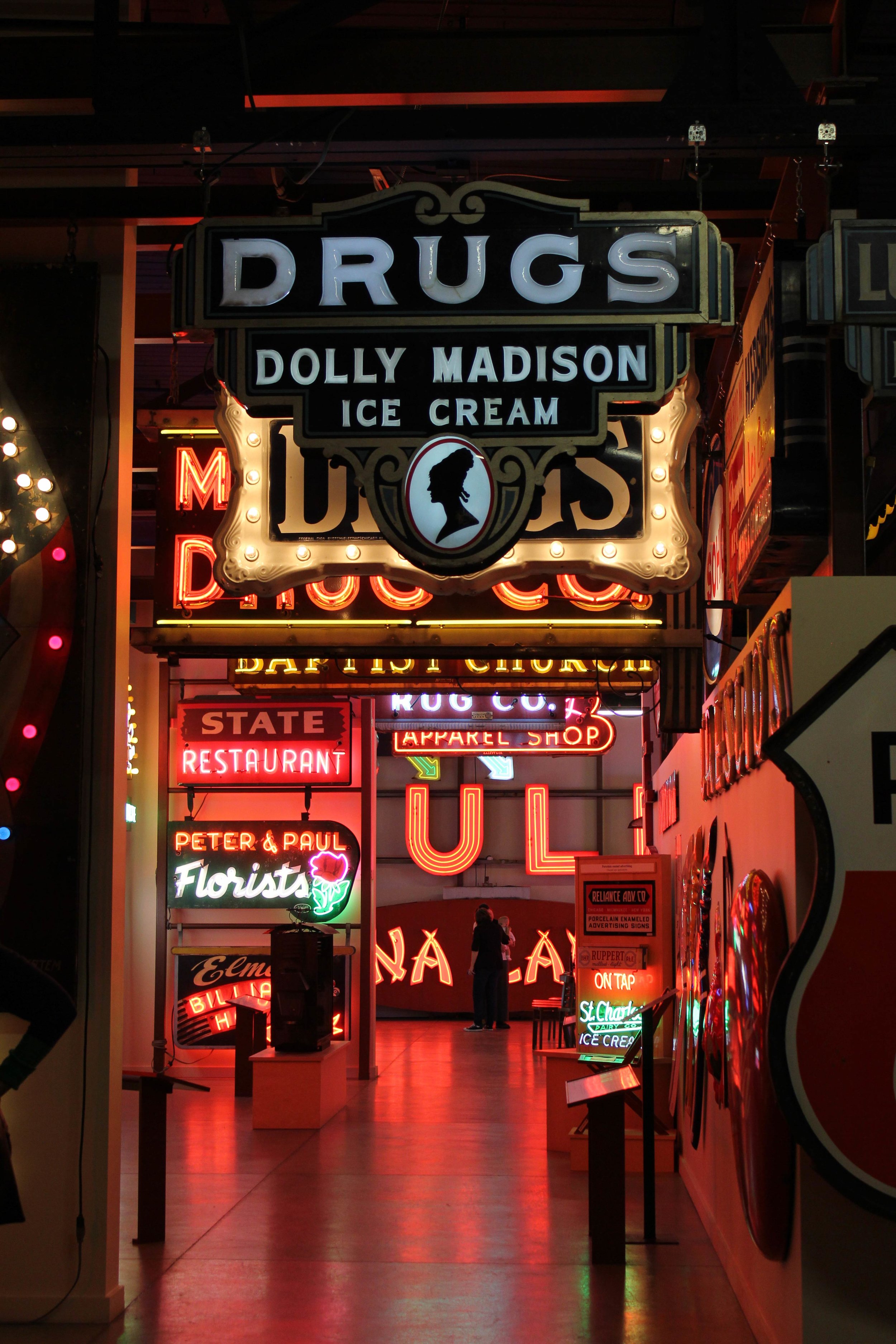
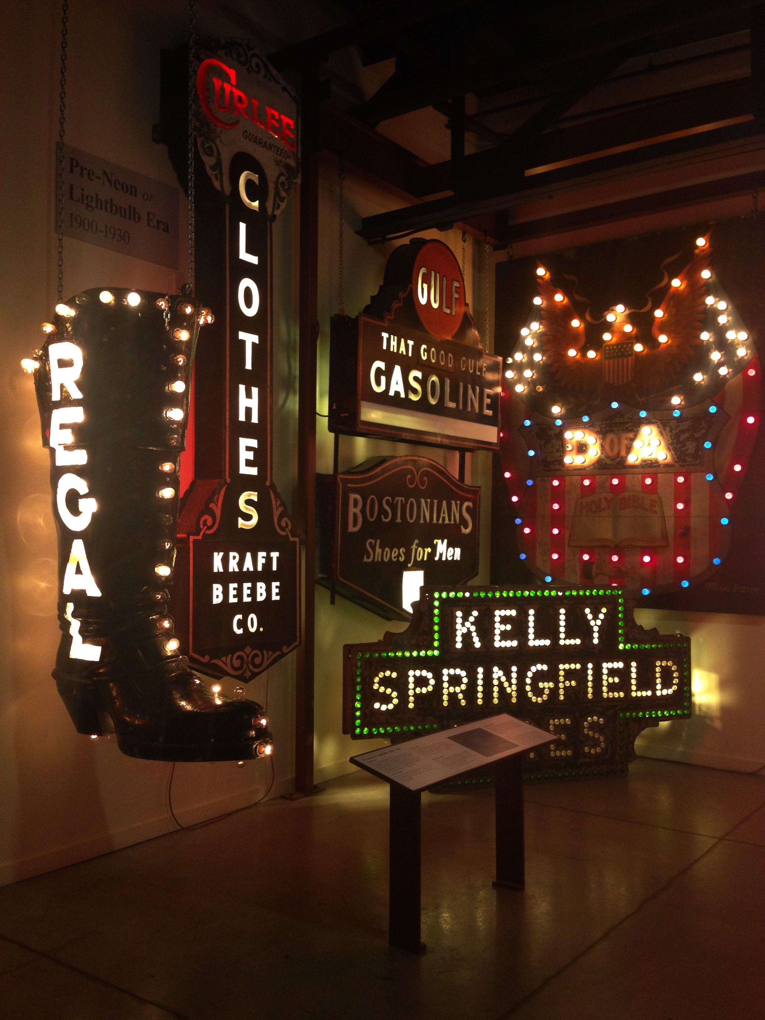
When asked about some of my favourite sign design resources, I mentioned a few in the interview and then realized I have so much more! My collection of old sign painting books has become an obsession of its own and this got me thinking to start a regular session of something called“ Off the Shelf” where I share titles and clips of some of my favourite sign books. So keep an eye on the news section for that!

Until next time, stay inspired and paint on!

Makers 2019 PDF | Podcast Link

Comment

SignMedia Magazine National Sign Competition

SignMedia Magazine National Sign Competition

Months ago I entered a few signs in the National SignMedia Competition - and didn't realize one of them had placed! The Parlour wall won runner up in the "Building Signs" category. Thanks to everyone involved in making this one happen!

Click on the article for a closer view.

Click on the article for a closer view.

NAIT TechLife Magazine Feature

NAIT TechLife Magazine Feature

NAIT was nice enough to feature me in their 10 year anniversary edition of TechLife alumni magazine about my unique job as a "sign painter". Here's the full article, enjoy!

Sled Island 2017

Silkscreened Poster Show

I was invited this year to design a poster for the annual poster show to kick off Calgary's Sled Island music festival. The posters were silkscreened in a limited edition of 30 and displayed for the duration of the event at Phil & Sebastian's Coffee Roasters in Mission. I had a lot of fun getting to draw some morbid stuff for the metal band Wolves In The Throne Room. The final posters were printed by Burnt Toast Studio - great job guys! 

Process

The photos show the final 3 colour poster as well as the initial sketches we went through as concepts for the final piece. The band provided LOTS of ideas to work from. Some of the concepts shown here that I decided to work off of include the celtic warrior theme, the dead being eaten by crows on the battlefield, human sacrifice, and cedar tree spirits. 

Designing for Sign Painting

There are a ton of resources for graphic designers to pick from these days. However if you're designing a period specific piece that you'd like to have painted, here are some fantastic resources for you to check out. Even if it's not a specifically dated piece, these typefaces are still great, with fantastic forms that depending on how you use them (like with everything) can end up looking quite modern.

Before we get to the good stuff, here's a short list of why you might want to pick from a pool of traditionally inspired typefaces:

1. Authenticity

If you're trying to hit a specific era with your design, research that period and then select typefaces commonly used during that time. If your sign is "inspired" by that period, these newly developed fonts might be a fine choice - but if it's a "heritage" piece that needs to be bang-on accurate, you're better off re-drawing the letters directly off old lettering manuals and type catalogues of that era. Archived photographs of signage used on old storefront buildings is another great resource in this case. And if you feel in over your head, I have a personal library filled with rare lettering manuals and catalogues that can do the trick.

2. Ease of Execution

Believe it or not, Helvetica wasn't designed for a paintbrush. Surprise - I know. It's subtle shifts between thick and thins make it a nightmare to paint. Choosing a font with consistent widths and easy proportions will not only make your painted sign look more authentic, but easier to execute. Making my job easier is secondary to the fact that it results in more natural, fluid brushstrokes and a better looking sign in the end.

2. Readability

With most fonts now being designed to be read on a screen, they don't always read well on a sign. They are designed for a short viewing distance and when scaled up for your storefront signage, all of a sudden thin strokes become too thin, and overall spacing and proportions make the words hard to read. Signs need to be read quickly - so legibility is a must. Consider if your sign is a decorative piece - in which case ornamental is alright - or is it to be read from far away while driving a car from the side of the road. Imitate the distance by scaling your typeface down and see if it's still easily readable.

3. Ease of Use for Other Pieces

The following resources contain fonts and design elements that are vectorized for quick and easy placement in your layouts. The upside is that they're quick and fast to lay out, scalable, and easily repeatable for use in your other designed pieces like websites and collateral pieces. 

Always remember though - if it ain't working on the screen, draw it out! I've spent hours pulling on vector handles, trying to get vectorized letters to do exactly what I want and have them curve just so, when it would have been faster just to draw it out with good ol' paper and pencil. Nevertheless, these fonts can be quick and easy - depending on how you're going to use them.

Enjoy!


Letterheads 40th Anniversary Meet in Cincinnati, OH

The Event

Photo Credit - Joanna Dawson

40 years ago a group of sign painters in the United States formed a little group to share some their tricks-of-the-trade, paint together, and of course have a little fun. Since then, the meets have grown from a handful of painters to hundreds. The marked difference at this year's event was the prevalence of a younger generation in their 20's & 30's making up the biggest chunk of attendees to date - and boy were we in our glory! What could be better than a bunch of eager artists just starting out, getting to work shoulder-to-shoulder with old pros who were happy and willing to share their knowledge and love of the trade? A short-lived slice of heaven is the best way I could describe it.


The Museum

I had the pleasure of meeting so many painters - some like me who are rather new to the trade and others who have been painting for 40 or 50 years. This year's event couldn't have been hosted at a more appropriate venue - The American Sign Museum. The museum alone would have been worth the trip. Jam packed with signs from all eras - neons, to mechanical moving signs, to gilded glass. The eye candy was overwhelming!


The People

There was a particular uncanny feeling of walking through this "hall-of-fame" sporting the work of American sign painting legends while walking among many of the painters themselves. I did manage to have a few embarrassing encounters with lettering legends I've looked up to since I started and whose work I've studied. I was happy to later find out that I wasn't the only one who became tongue tied and a little stupid when getting to meet my heroes face-to-face. The best part about meeting these people is you find out how genuine and down to earth they all are. And they sure know how to have a good time!


Joanna was nice enough to lend me a number of her photos she took over the weekend so I'd like to thank her. She does commission glass work and is based in the Los Angeles area: joannadawsonart@gmail.com


The Classes

Although I wanted to take every class offered at this year's event, I chose to take the 2 day workshop with Bill Hueg and Anna Weber on pictorial painting. Bill was a billboard painter for the most part and painted many large-scale pictorial pieces and murals. It was great going back to where I started myself- realistic painting - which I hadn't touched since art school. Listening to Bill and watching him paint reminded me of all the good things I liked about pictorial painting and renewed my interest in getting back into it once I got back home. We painted a monochromatic and colour version of the same still life, working off his paintings which he did from life. What I was really interested in was hearing Bill describe the difference that scale makes in your approach to a pictorial painting. You have to be a lot more methodical on the wall - you can skip all around a small painting, but if you're working at wall scale, you can't be skipping all over the place. Most anyone can become a good painter, but equally important is becoming efficient at it.


Mural Projects

Over the course of the weekend, six murals were painted around the American Sign Museum. The design and organization for each mural was led by certain individuals in the planning and design stages. During the event, teams organized to help execute the painting and see the murals to completion. I got up on the scaffold myself and roughed in a hub cap which was later perfected by Alton Gillespie (in other words, completely covered over. Thanks Alton. In years to come I'll be the crazy old lady bragging about her buried hubcap on that mural from way-back-when.) Each mural was designed based on something related to Cincinnati and captured a part of the city's history. It was a gruelling task and the level of detail and craftsmanship on the murals was really astounding to see it all completed in only 4 days. The best sight was Bill Riedel, nearly 90 years old, sitting in a chair 8 feet up on scaffolding, mahlstick in hand, painting in the numbers on a radio dial. A close second was watching Bill Hueg paint his 20 foot tall baseball player alter-ego with matching moustache.


Pinstripers & Panel Jams

If I were to list the areas of painting I'd like to work on this coming year, pinstriping would be up there next to improving my pictorial work and learning to paint Roman Capitals. I had previously thought pinstriping was two things: 1. painting straight lines, which didn't seem too interesting 2. ornamental zig-zags on the hoods of cars which I wasn't really that into either. Turns out that as I was dismissing it as something I really didn't have a use to learn, I found all sorts of occasions where I wished I knew how to pull a long, smooth and steady line - outlines on large letters, borders on signs, skinny highlights, and my new personal favourite - skinny, bouncy script lettering. Spending some time with the pinstripers was a really eye-opening experience which made me realize it was all about how to pull a brush with control - beyond that, you could apply it to so much more than vehicles! At the back of the museum, locals pulled up their hotrods for the stripers to work on when they found out these guys were going to be in town. I had the pleasure of watching over Alan Johnson's shoulder as he worked on one. I got to also meet DeWayne Connot and Darrell Roberts - both really great gentlemen who were nice enough to give myself and Joanna pretty much a full seminar and demo on the basics of striping and brush handling while we were wandering around.


The Sights Around Cincinnati

Cincinnati was an interesting city - pretty much bordering the northern border of Kentucky so for a city in Ohio, has a lot of southern influence. What I've figured out though, is that everywhere I travel in the states, most everyone is originally from Chicago - either a true statistic, or just some strange twist of fate. In lieu of the traditional sightseeing, I did a tour of downtown. Every trip I make to the States I marvel at the amount of old architecture they have standing. What was particularly striking about Cincinnati was the amount of Victorian-style buildings - beautifully ornate houses as well as tall skinny commercial shops. The most interesting part of my self-guided tour was the Over-The-Rhine area just north of downtown where many city blocks of abandoned and low-income housing were in the midst of being transformed into a trendy district of shops, markets, and condos. I managed to get some shots of the old apartment blocks soon to be gutted. I also took some shots over by the Ohio River, which was massive, some Art Deco era skyscrapers downtown and of course, a few signs and murals.


Videos

Gilding Workshop with Noel Weber and Dave Smith

Noel Jr. Weber, Lucy Weber, myself, Dave Smith, Noel Weber Sr.

Noel Jr. Weber, Lucy Weber, myself, Dave Smith, Noel Weber Sr.

Last week I had the most incredible experience of attending a reverse gold gilding workshop with masters of the craft - Dave Smith of Torquay, England and Noel Weber of Classic Design Studio in Boise, Idaho. They managed to cram what felt like a term's worth of art school into three and a half days - and it was glorious! Not only were these two fountains of knowledge, but they were happy to share and some of the most generous people I've ever met. 

I had a few days prior to getting down to work, so I took the opportunity to tour the city and snap a few shots of some of the signage work done by Noel and his shop in Boise, which you can view further down in the page.

The Process

We worked off of a beautiful design made by Dave - a Victorian style "B" for Boise. After a short lesson in applying vinyl to glass and screen printing the designs overtop, we hand-cut the patterns out on the areas to be acid etched. This process gave us the texture in areas at the bottom of the "B". Later, when water gilding the entire area, these textured portions stand out with a slightly more matted appearance from a distance. We hand-cut the vinyl with our screen printed design on it to expose the areas to be etched. Then the acid was mixed with mica flakes, applied in a paste, timed, and rinsed. 

After our glass had the texture etched into it, we water gilded the entire surface from the back. The differences in texture on the glass resulted in subtle shifts in how the applied gold reflected the light. The smooth portions showed off a mirrored finish, while the slightly textured areas were reflective, but appear slightly mottled. After the gold dried, we screen printed the design back over the gold to hold down the gold in the areas we wanted it to stay. The rest is let to dry and brushed off with Bon Ami glass cleaner and water. We were then shown various back-painting and blending techniques to apply graduated colour to the glass from behind. The degree of blending achievable with just a brush was quite amazing - almost with an airbrushed appearance. It became very apparent at this point, that experience with moving the paint and gauging drying times were important. We blended with with the brush, but also got right in there with a stippling brush and even our fingers. I like to tell people I finger painted the whole piece...

Photo Credit - Matthew Wordell

Photo Credit - Matthew Wordell

We also got the chance to learn a technique called glue chipping - which involves sandblasting areas of the glass and then applying a hide glue to the surface. As it dries, the glue yanks off a thin layer of glass and gives it these amazing deep patterns of chipping which can then be gilded (much like the acid-etched portion of the "B") Depending on how the glass chips off, you can end up with tiny little circles, or big swooping clam/feather looking chips. It's another technique to experiment with on projects! We also got to experiment with gilding on a slumped glass piece. After screen printing the image on each circle, the glass pieces were placed on metal rings inside the kiln and at controlled temperatures, heated, causing the glass to slump into a globe-like shape. The pieces can then be gilded with different types of gold, as shown in the last image in the following series of photos.

The Facilities

Here are a few images of the amazing shop setup. Classic Design is really a hidden gem in the city and well worth the visit! They have the main painting area with an office and a shop with a CNC mill, various saws, and a spraybooth. Adjoining the two areas is an open courtyard with a sand-blasting booth and seating for when you just want to eat some pizza and crack open a beer. They are next to a screen printing and neon bending shop with an artist residency and gallery space on the other side. The place is a creative zone for collaborators working and making art. A dream setup!

Of course, the shop was full of eye-candy and inspiration. Here are just a few of the pieces that Noel had laying around the shop.

Boise

Because I came a few days early and stayed a few days later, I did some sight-seeing around Boise. The following is a few photos I snapped from around town. They include some of the hand-painted signage done by Noel Weber and his Classic Design Studio as well as images of some old houses being restored in the area, and some parks. Boise is a beautiful city and I was pleasantly surprised by the artistic culture and rich history that seemed to permeate the downtown.

Photo Credit - Matthew Wordell

About the Instructors

Check out Noel Weber's Classic Design Studio. They do SO much more than gilding - you can see they offer workshops in gold gilding on glass (which was this class) as well as classes on neon, glass casting, and porcelain enamel (which is a workshop coming up this October for people who are interested.

David Adrian Smith is a sign writer based out of Torquay, England. He has been sign writing since he was 14 years old. When he saw some of Noel's glass gilding work, he wrote him a letter asking if he could come to America and learn his techniques. Since then, he's become one of the best-known glass gilders, doing work for high-profile clients including John Mayer for his "Born and Raised" record cover. Dave offers classes in his home studio in Torquay which are worth checking out as well. Check out his website at davidadriansmith.com.

Brief History on Sign Painting

I was approached by the fine people at SNAP Printshop & Gallery in Edmonton to write a little article on sign painting for their upcoming issue of SNAPLine. I decided to approach it as a brief history (as I know it) as it pertains to my own personal practice. And please check out SNAP's website. They are a FANTASTIC printmaking resource in Alberta and offer many classes and studio rental in their beautiful facility!

A BRIEF HISTORY OF SIGNPAINTING – and the resurgence of craft

“So You Want to Paint Letters, Do You?” were the opening lines in the little zine-like manuals handed out at the beginning of New Bohemia Signs’ Introduction to Brush Lettering” Workshop. As I took a look around the little California sign shop, with its walls plastered with hand-painted eye-candy, sitting in front of the paint stained easel boards setup with enticingly fresh paper  – yes, I thought to myself. Yes I do!

Excerpt from Ralph Gregory's "Sign Painting Techniques".

Excerpt from Ralph Gregory's "Sign Painting Techniques".

Mike Meyer's rendition of the single-stroke gothic alphabet. It's practicing exercises like this that'll get you the brush skills you need to succeed.

Mike Meyer's rendition of the single-stroke gothic alphabet. It's practicing exercises like this that'll get you the brush skills you need to succeed.

I had been dabbling in sign painting for awhile prior to this workshop, working for an old-timer in Calgary who generously took me on as his part-time apprentice, so I had heard a lot about what a traditional sign painter had to say about his trade – and it used to be thought of as just that – a trade – no different from a mechanic or a carpenter and with about just as much glamour. Sign painting was a lucrative, practical trade and extremely common. You’d be surprised by the number of people who can say they’ve been a sign painter at some point in their lives. My previous landlord was a sign painter. He was also a man, which was the norm for the field in those days. Why would women be interested in getting paint under their nails? And the logistics of getting up a ladder in a dress would mean she had to wear pants, and so you see the problems unravel… And nevermind higher education. Any man could pick up a brush and a mahlstick and with practice and proper techniques, apprenticing alongside experienced painters, make a good living at being a sign painter.

This sign painting shop in San Francisco shop was not the norm – not today, not 30, not 50 years ago. It wasn’t pumping out orders of eighty identical real-estate signs that would be thrown away within a week or two. And they weren’t hell-bent on the “rules” of lettering. We were encouraged to have fun. It wasn’t grudgingly practical, it was artistic. It felt like a painting or printmaking studio from art school where people talked about the local indie music scene and organic gardening over their shoulders with each other as they painted. Yet to see a sign painting shop flourishing on a scale larger than a one-person operation (as most today are) is rare. To be able to paint letters well enough and fast enough to be able to convince a business to pay for their signage to be done that way at a time when printers and vinyl can produce a cleaner, faster job every time is a tough sell. But it’s being done. How? Because it now serves a niche market. There are a few people who are willing to pay more for a process that is long, inefficient, inconsistent and riddled with problems related newer, unreliable materials – because it’s not printed, it’s not plastic, it’s handmade. The beauty happens when a competent painter has the skills to execute a clean, sharp, smooth signdespite these factors. I don’t want people looking at what I’ve just done and think, “Oh – that looks handmade”. Or “I could do that”. Handmade or hand-painted shouldn’t translate into an excuse for poor quality or shoddy painting. I’m always working to bring a higher level of skill and craftsmanship to the work that makes people feel proud to own it and to show it off. If they feel they could have just done it themselves, I don’t think they’re going to value that object nearly as much. I think our generation is tired of cheap, crappy products distributed from big box retailers. Hand-painting signs and objects is a way to restore some of that value and personal touch back into things. 

The Naginta Cup was a fun project I just finished for a friend's competitive hockey pool. This was adapted from another design and re-jigged to fit the content. And metal leaf on glass adds some class!

The Naginta Cup was a fun project I just finished for a friend's competitive hockey pool. This was adapted from another design and re-jigged to fit the content. And metal leaf on glass adds some class!

Sign painting isn’t the trade it used to be. You can’t just learn some brush skills and be able to feed yourself off it anymore, travelling from town to town sleeping in your car and painting signs all across the country. It’s become something that (what I think) is much better. It has morphed into a strange and glorious intersection between art, design, and craft. In glasswork, it’s also equal parts painting and printmaking – which is something that for the longest time I had no idea about. It’s equal parts function, luxury item, piece of art and commercial practicality. The rising interest in craft and handmade, locally produced items is only adding to its rise in popularity. Sign painting now belongs to a new generation of artists, graphic designers and letterers who maintain respect for tradition, but are adapting it to its new environment and breaking rules along the way. All forms of hand lettering – both drawn and painted – are becoming increasingly popular in graphic design applications including logos, packaging, advertising and editorial work in addition to signage. It has come full circle – offering us the organic-ness and adaptability that took a back seat for years as the printing press and then the computer wowed us and then dulled us with it’s linear grids. Just as analog photography teetered near the brink of death when digital became all the rage, so too has hand lettering and sign painting come back to life. You’d think that this cycle has happened enough times that we’d not go ahead and throw out the “old” technology as soon as something new arrives, but we are a strange and silly species... I’m just happy to be here at this moment and have the pleasure of riding this wave out as long as I can. Viva La Sign Painting!

Dessart Studio Bringing the Art of Sign Painting to Royal Bison Fair in Edmonton!

Dessart Studio Bringing the Art of Sign Painting to Royal Bison Fair in Edmonton!

Calgary Sign Painter Comes Home!

I'm honoured to be participating in the first Canada-wide version of the much loved Edmonton craft fair, the Royal Bison. Thanks to you guys, I'll be bringing my wares back to my hometown and touting everything from traditional sign painting on wood, to Mason Jar drinking glasses, to gold gilding on glass, to (yes I had to…) some mildly Christmas-y stuff.

A Little Background

I got hooked on painting signs after leaving my first "real" job out of school working in a vinyl shop. I parted from Edmonton in 2012 to pursue graphic design in Calgary and soon found out that I yearned for something much more hands-on. I ordered a bunch of paints and just started painting signs. Shortly after, I took an Intro to Brush Lettering at New Bohemia Signs in San Francisco, CA and never looked back. I quit my job at the vinyl shop and by a chance encounter, found a sign painter here in Calgary who took me on in an apprenticeship - which is practically unheard of these days. I worked with him for almost a year, learning tricks of the trade until it was time I went out on my own. I ordered as many books as I could afford on the subject and continued my studies. Now it's a just been a matter of time and practice!

Sign Painting - The Adaptable Art

For the Bison, I'm bringing with me small signs with varying letter styles. Some hand-drawn and some adapted from old lettering catalogues. Some wood, some glass, some gold gilding, some straight painted. It's just a cross-section of what can be done with sign painting - and shows how versatile the media is. It can be done on flat surfaces, existing walls, windows, objects, brick buildings - you name it. I'm currently accepting clients, so if you like what you see, contact me for business pricing and we can talk about how to bring your storefront, home, or office to life with sign painting!

Check out the Bison's full list of vendors for the upcoming 2014 winter shows. Make sure to check out both showings - the Edmonton Locals-Only Edition (November 28, 29, 30th) as well as their Prairies-Wide Edition (December 5, 6, 7th)

"Applause" for Carly Green, Edmonton Sculptor

"Applause" for Carly Green, Edmonton Sculptor

Applause is Well Deserved

Congratulations to Carly Greene on a job well done! Her show Out of Sight, Out of Mind Old Boy showed off the pieces inspired by her residency in the Ortona Armoury Arts Building. What better way to congratulate than a sign? It kinda says it all.

Check out more of Carly's work here: http://www.carlygreene.com

Keeping Hand Skills Alive and Well

Keeping Hand Skills Alive and Well

Working with my dad in the family home backyard. 1990, Edmonton, AB

Some of my best childhood memories included time spent with my dad, making stuff. When I was old enough to hold a hammer, he would set out a chunk of 2x4 lumber with some nails started in it and I eagerly pounded away at the block alongside him as he worked on other projects. When I got a little older, I got upgraded to actually helping him with the projects. He was forever renovating our home so I got to do a lot of things that other kids never did - tearing down walls inside our house, building fences, tiling bathrooms, painting bedrooms, and the list goes on. Sure I complained through some of the jobs, but for the most part, it was fun and it was rewarding. What kid doesn't like being able to put a hammer through the drywall in their living room? 

What I didn't realize was that I was learning a lot of things during these years - how to work with materials using my hands, how to choose suitable materials for a project, how to conceptualize something in my mind and then create a plan to make it. Perhaps one of the most important things I learned from my dad the carpenter, was that if you don't know how to do something, you figure it out. There were so many times that I watched him wrestle with problems like these. He'd start out having no idea how he was going to remove that tree stump from the front yard, and then weld himself a customized tool from scraps in his garage to help him accomplish exactly what he wanted to do. To me, that was magical. It was having power and independence. He didn't have to call anyone to do it for him - he did it himself.

With a new generation of kids now growing up in a digital world, spending most of their time in front of interactive screens, I think it's important to continue to teach kids the fundamental skills acquired by engaging with the physical world. It's not just about learning the skill of building things, but empowering kids with creative problem solving skills and self-esteem to know that they can go through life and just "figure it out".

Here's the article from the NPR news website that inspired me to reflect on a childhood imbued with making things: Putting Power Tools In The Hands Of 5-Year-Olds